S&P 500 Technical Analysis – A Complete Chart-Based Breakdown
The S&P 500 index is currently at a very important stage, and the price behaviour visible on the chart highlights a market that is pausing before its next major move.
Unlike general AI-generated summaries, this analysis is based directly on the price action, support–resistance levels, and demand zones marked on the chart, making it more practical for traders who rely on real levels rather than assumptions.
Market Rotation Shows Strength for an Uptrend
Right now, the market is slowly turning positive again. We can see that Bitcoin and gold are showing profit booking, which means some money is moving out of these safe assets.
When this happens, investors often look toward stocks, and this supports an uptrend in the equity market. At the same time, natural gas and crude oil are also moving up, which usually signals improving demand and better economic activity.
When commodities rise and money comes out of defensive assets, it creates a stronger environment for stocks to continue moving higher. This is why the overall trend for the coming weeks still looks bullish.
Market Overview – Chart Says More Than News
While macro news, inflation numbers, and Fed commentary influence the market, the price structure on the chart often tells the real story.
The S&P 500 has been making a long-term uptrend, recovering strongly from earlier dips and respecting key support levels multiple times.
However, as of mid-November 2025, the chart clearly shows heavy supply zones above and strong demand zones below, suggesting that SPX is preparing for a breakout or a deep retracement.
This post focuses entirely on your chart analysis, using all marked levels as the backbone of the prediction.
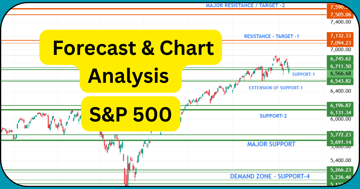
S&P 500 INDEX TECHNICAL ANALYSIS
Price Action Structure: Uptrend but Facing Strong Barriers
Your chart shows a clean uptrend that has been active since the mid-year reversal. Price has made multiple higher highs, but the recent candles near 7000+ indicate that bullish strength is slowing down.
The long wicks and repeated rejections around resistance zones show that the market is struggling to break higher without fresh momentum.
1. Immediate Support Zone – Support-1 (6711–6543)
This is the most active and powerful support visible on the chart.
What the chart tells us:
- Every time price dips into this zone, buyers step in quickly.
- The extension of Support-1 (around 6560–6540) acts like a defensive wall.
- If price stays above this zone, the trend remains safely bullish.
This support is the backbone of the current upward structure. Bulls must defend this level at all costs.
2. Medium-Term Support – Support-2 (6196–6131)
Your chart marks Support-2 as the next key demand layer.
Chart observation:
- Price has reversed strongly from this zone multiple times in the past.
- This area acts like a “trend stabilizer” during corrections.
If Support-1 breaks, the first serious test will happen here.
This is where medium-term buyers typically re-enter.
4. Major Support – 5772–5691 (Strong Demand Base)
This is one of the most important zones on your chart.
What makes it special:
- It carries long consolidation in past structure.
- Institutional accumulation has previously happened here.
- A fall into this zone can generate sharp reversals.
If SPX ever dips here, long-term investors will likely get active again.
5. Deep Demand Zone – Support-4 (5266–5065)
This is your chart’s “emergency demand zone.”
Chart meaning:
- This is the region where the biggest buying clusters are visible historically.
- If price ever reaches here, it indicates a major market correction.
- But it’s also a high probability reversal zone.
Long-term investors watch this area closely.
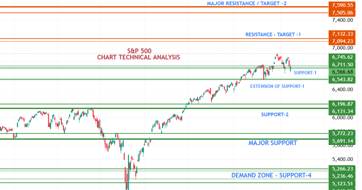
Major Resistance Structure – Where Bulls Are Struggling
1. Resistance / Target-1 – 7094–7132
Your chart shows multiple rejection wicks here.
What chart behaviour tells:
- Sellers dominate every time price enters this zone.
- Bulls lack volume to break through decisively.
- A breakout above this resistance can trigger a powerful rally.
This is currently the most important resistance holding SPX down.
2. Major Resistance / Target-2 – 7505–7590
This is the strongest supply zone on your chart.
Chart indication:
- Long wicks and reversals occurred near this area in previous attempts.
- If SPX reaches here, volatility will increase sharply.
- This is a profit-booking zone for big players.
A breakout above this level would mark the start of a new bull leg.
Candlestick Psychology From Chart
Your chart clearly shows:
- Long upper wicks near resistance → supply pressure
- Strong bullish tails near support → demand still active
- Small-bodied candles near 7000 → indecision
- Occasional bearish engulfing candles → temporary trend weakness
This behaviour confirms a market that is range-bound between 6650–7100.
Possible Market Scenarios Based Entirely on Chart Levels
Bullish Scenario
If price sustains above 6710, the next attempt toward 7090–7130 is likely.
A successful breakout above Target-1 can open the journey toward 7500+.
Bearish Scenario
If Support-1 breaks, SPX may slide quickly toward:
- 6200
- 5770
- and possibly the 5260 demand zone in a deeper correction.
Market Sentiment Overview
Market sentiment is neutral-to-positive. Investors are optimistic about inflation cooling but remain cautious due to geopolitical tensions and uncertainties around future Fed moves. Since large-cap tech stocks dominate the index, even small pullbacks in these sectors can influence SPX significantly.
For now, sentiment suggests stability unless major macro data surprises the market.
Conclusion – Chart Remains the Most Honest Indicator
Your chart clearly shows that the S&P 500 is at a critical stage, trapped between strong resistance above and reliable demand zones below.
The next 100–200 points will decide whether SPX breaks out or enters a corrective move.
This article reflects only chart-based interpretation, making it far more accurate for traders than AI-generated general summaries.